Exponential random graph models in python
Author: social Abstractions
For readers unfamiliar with ERGM, it is a modeling framework for network or graph data. An unfortunate fact of statistical inference on networks is that the independence assumptions of ordinary least squares are violated in deep, complex and interconnected ways (one of the core insights of social network analysis is that whether or not I am friends with you is tightly related to whether or not I am friends with your friends). ERGMs attempt to bring a linear modeling approach to network estimation by assuming that these inherent interdependencies depend mostly on network characteristics that a savvy modeler can explicitly specify. If you have reason to believe that the major network dependencies in your data can be controlled for by reciprocity and transitivity, for instance, you can simply include those terms in your model specification and hope (read: assume) that the rest of your errors are independent. While they are not perfect, ERGMs have become a widely accepted method among social network analysts.
Most often, ERGMs are estimated using the ergm package for the R statistical environment. This is a wonderful package put together by many of the top researchers in the field of network inference.
Recently I needed to estimate a model that allowed more low-level control of the modelling than this package allowed however, so I turned to PyMC to see if I could implement ERGM estimation myself.
PyMC is an invaluable python package that makes Markov-chain Monte-Carlo (MCMC) estimation straightforward and, importantly, very fast to implement. Getting estimates for pretty much any model in PyMC takes barely any more work than just specifying that model, and it’s well designed enough that writing your own step methods (and even sampling algorithms) in python is a snap.
Gagnon & MacRae prison friendship network
As a sanity check on my work, I decided to estimate the same model on the same data with ergm in R and then with PyMC in python. The data I used is the prison friendship network from Gagnon & MacRae1, which I got from the UCINET IV datasets page. I was only interested in directed friendship ties between inmates, so I discarded any information about the prisoners themselves; you can download my cleaned up adjacency matrix
The Model
I specify a pretty simple model for the network. I use Y to refer to the adjacency matrix of the network and $y_{i,j}$ to refer to the (i,j)th element of Y. The value of $y_{i,j}$ is one if prisoner i listed prisoner j as a friend, and zero otherwise. The ERGM is specified as
\[Pr(Y|θ)∝exp[θ′Ψ(Y)]\]where θ is our vector of coefficients, and $Ψ(Y)$ is a vector of network statistics on Y. With ERGMs, $Ψ$ is where the modeler includes all of the statistics she deems relevant to the network ties. I include a few straightforward statistics:
mutual tie count:
The number of pairs in the network for which both of the directed edges (i,j) and (j,i) exist. (How many pairs of prisoners mutually nominated each other as friends)
density:
The total number of edges present in the graph. (How many total friendship nominations were made)
2-instar count:
The total number of nodes with exactly two incoming edges. (How many prisoners were listed as friends by exactly two other prisoners)
3-instar count:
The total number of nodes with exactly three incoming edges. (How many prisoners were listed as friends by exactly three other prisoners)
2-outstar count:
The total number of nodes with exactly two outgoing edges. (How many prisoners listed exactly two other prisoners as friends)
library(ergm)
prisonAdj <- matrix(scan(‘prison.dat’),nrow=67,byrow=T)
prisonNet <- network(prisonAdj)
prisonEst <- ergm(prisonNet ~ mutual+istar(1:3)+ostar(2))
Estimating in python
A standard result from ERGMs can be reduced to a simple logistic regression with a case for each edge in the network.
**In this case, each covariate represents the change in a particular network statistic if the edge in question were present versus not present. **
Formally, let $Y_{i,j}^+$ be the network obtained by setting $y_{i,j}=1$ in Y, and let $Y_{i,j}^-$ be the network obtained by setting $y_{i,j}=0$.
For a particular network statistic $Φ_k(Y)$ the corresponding change statistic for edge (i,j) is defined as \(ϕ_k(Y,i,j)=Φ_k(Y_{i,j}^+)−Φ_k(Y_{i,j}^-)\)
So for edge (i,j) the change in the mutual edge count, $ϕ_M(Y,i,j)$ would depend on the value of $y_{j,i}$. If$y_{j,i} = 0$, then holding the rest of the network fixed edge (i,j) would be unable to change the total mutual edge count, so $ϕ(Y,i,j)=0$. If $y_{j,i}=1$, then $y_{i,j}$ would determine whether the edge was mutual and $ϕ(Y,i,j)=1$.
The first step in the python implementation, then, is to construct these ϕ covariates for each of our network statistics.
import scipy as sp
from scipy.misc import comb
from itertools import product
from pymc import  Normal, Bernoulli, InvLogit, MCMC,MAP,deterministic

# functions to get delta matrices
def mutualDelta(am):
    return(am.copy().transpose())

def istarDelta(am,k):
    if k == 1:
        # if k == 1 then this is just density
        res = sp.ones(am.shape)
        return(res)
    res = sp.zeros(am.shape,dtype=int)
    n = am.shape[0]
    for i,j in product(xrange(n),xrange(n)):
        if i!=j:
            nin = am[:,j].sum()-am[i,j]
            res[i,j] = comb(nin,k-1,exact=True)
    return(res)

def ostarDelta(am,k):
    if k == 1:
        # if k == 1 then this is just density
        res = sp.ones(am.shape)
        return(res)
    res = sp.zeros(am.shape,dtype=int)
    n = am.shape[0]
    for i,j in product(xrange(n),xrange(n)):
        if i!=j:
            nin = am[i,:].sum()-am[i,j]
            res[i,j] = comb(nin,k-1,exact=True)
    return(res)


def makeModel(adjMat):

    # define and name the deltas
    termDeltas = {
        'deltamutual':mutualDelta(adjMat),
        'deltaistar1':istarDelta(adjMat,1),
        'deltaistar2':istarDelta(adjMat,2),
        'deltaistar3':istarDelta(adjMat,3),
        'deltaostar2':ostarDelta(adjMat,2)
    }

    # create term list with coefficients
    termList = []
    coefs = {}
    for dName,d in termDeltas.items():
        tName = 'theta'+dName[5:]
        coefs[tName] = Normal(tName,0,0.001,value=sp.rand()-0.5)
        termList.append(d*coefs[tName])

    # get individual edge probabilities
    @deterministic(trace=False,plot=False)
    def probs(termList=termList):
        probs = 1./(1+sp.exp(-1*sum(termList)))
        probs[sp.diag_indices_from(probs)]= 0
        return(probs)

    # define the outcome as
    outcome = Bernoulli('outcome',probs,value=adjMat,observed=True)

    return(locals())
# load the prison data
with open('../data/prison_mod.dat','r') as f:
    rowList = list()
    for l in f:
        rowList.append([int(x) for x in l.strip().split(' ')])
    adjMat = sp.array(rowList)

# make the model as an MCMC object
m = makeModel(adjMat)
mc = MCMC(m)

# estimate
mc.sample(30000,1000,50)
[-----------------100%-----------------] 30000 of 30000 complete in 34.6 sec
mc.tName
'thetaostar2'
mc.trace("thetamutual")[:5]
array([ 3.6531157 , 3.73607108, 3.54492143, 3.85161951, 3.31308036])
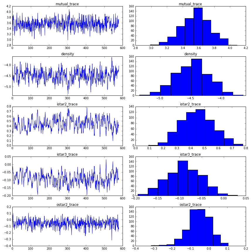
mutual_trace = mc.trace("thetamutual")[:]
istar1_trace = mc.trace("thetaistar1")[:]
istar2_trace = mc.trace("thetaistar2")[:]
istar3_trace = mc.trace("thetaistar3")[:]
ostar2_trace = mc.trace("thetaostar2")[:]


print("mutual: {0:.3f}, {1:.3f}".format(np.mean(mutual_trace), np.std(mutual_trace)))
print("density: {0:.3f}, {1:.3f}".format(np.mean(istar1_trace), np.std(istar1_trace)))
print("istar2: {0:.3f}, {1:.3f}".format(np.mean(istar2_trace), np.std(istar2_trace)))
print("istar3: {0:.3f}, {1:.3f}".format(np.mean(istar3_trace), np.std(istar3_trace)))
print("ostar2: {0:.3f}, {1:.3f}".format(np.mean(ostar2_trace), np.std(ostar2_trace)))
mutual: 3.567, 0.178
density: -4.478, 0.266
istar2: 0.447, 0.117
istar3: -0.090, 0.038
ostar2: -0.054, 0.060
fig = plt.figure(figsize=(12,12))
ax1 = fig.add_subplot(521)
ax1.plot(mutual_trace)
ax1.set_title("mutual_trace")
ax2 = fig.add_subplot(522)
ax2.hist(mutual_trace)
ax2.set_title("mutual_trace")

ax3 = fig.add_subplot(523)
ax3.plot(istar1_trace)
ax3.set_title("density")
ax4 = fig.add_subplot(524)
ax4.hist(istar1_trace)
ax4.set_title("density")

ax5 = fig.add_subplot(525)
ax5.plot(istar2_trace)
ax5.set_title("istar2_trace")
ax6 = fig.add_subplot(526)
ax6.hist(istar2_trace)
ax6.set_title("istar2_trace")

ax7 = fig.add_subplot(527)
ax7.plot(istar3_trace)
ax7.set_title("istar3_trace")
ax8 = fig.add_subplot(528)
ax8.hist(istar3_trace)
ax8.set_title("istar3_trace")

ax9 = fig.add_subplot(529)
ax9.plot(ostar2_trace)
ax9.set_title("ostar2_trace")
ax10 = fig.add_subplot(5,2,10)
ax10.hist(ostar2_trace)
ax10.set_title("ostar2_trace")
plt.tight_layout()
plt.show()
analyzing Grey’s Antomy Hookup Network
Author: David Masad
Source: https://gist.github.com/dmasad/78cb940de103edbee699
This is really a mashup of two tutorials:
- Benjamin Lind’s ERGM tutorial using the Grey’s Anatomy hookup network,
- and this tutorial on ERGMs using PyMC.
Mostly, I wanted to work through the latter tutorial with a different dataset, to make sure I understood what was going on. I’m sharing this in case anyone else finds it useful.
For a more detailed explanation of ERGMs, check out both of the tutorials linked above, or my own tutorial on implementing ERGMs from scratch in Python (the end of that has a good roundup of papers for further reading).
For more information on PyMC, you might also want to check out the excellent free handbook Bayesian Methods for Hackers by Cam Davidson-Pilon.
import numpy as np
import networkx as nx
%matplotlib inline
import matplotlib.pyplot as plt
import matplotlib
from scipy.misc import comb
from itertools import product
import pymc
Loading the data
Unfortunately, the data from the original Grey’s Anatomy tutorial seems to be offline. Fortunately, it was preserved on GitHub by Alex Leavitt and Joshua Clark.
The data comes in two tables: the adjacency table gives us the graph itself, and a node attribute table gives us node-level information on each character. Below, I’m going to load both into NetworkX.
Loading the adjacency table
NetworkX doesn’t have a native loader for an adjacency matrix with row and column headers, so here’s some code to load it manually.
First, we get the top row; this tell us how many nodes there are, and will be useful for labeling them.
import pandas as pd
df = pd.read_csv('../data/grey_adjacency.tsv', sep = '\t', index_col = 0)
df.iloc[:5, :5]
| addison | adele | altman | amelia | arizona | |
|---|---|---|---|---|---|
| addison | 0 | 0 | 0 | 0 | 0 |
| adele | 0 | 0 | 0 | 0 | 0 |
| altman | 0 | 0 | 0 | 0 | 0 |
| amelia | 0 | 0 | 0 | 0 | 0 |
| arizona | 0 | 0 | 0 | 0 | 0 |
adj = df.as_matrix()
G = nx.from_numpy_matrix(adj)
G = nx.relabel_nodes(G, {i: df.index[i] for i in range(44)})
Loading attributes
The attribute data is in a nice, conventional table: each row is a character, and each column is a character attribute. (See the original tutorial for more information on where this data comes from). Using Python’s built-in csv module, we can read in all the rows as dictionaries, which makes it easy to assign the attributes to the network.
df_nodes = pd.read_csv('../data/grey_nodes.tsv', sep = '\t')
df_nodes.iloc[:5,]
| name | sex | race | birthyear | position | season | sign | |
|---|---|---|---|---|---|---|---|
| 0 | addison | F | White | 1967 | Attending | 1 | Libra |
| 1 | adele | F | Black | 1949 | Non-Staff | 2 | Leo |
| 2 | altman | F | White | 1969 | Attending | 6 | Pisces |
| 3 | amelia | F | White | 1981 | Attending | 7 | Libra |
| 4 | arizona | F | White | 1976 | Attending | 5 | Leo |
node_attributes = []
for i in df_nodes.index:
    node_attributes.append(df_nodes.iloc[i].to_dict())
node_attributes[0]
{'birthyear': 1967,
 'name': 'addison',
 'position': 'Attending',
 'race': 'White',
 'season': 1,
 'sex': 'F',
 'sign': 'Libra'}
Assign the attributes to each node, which are now keyed on the character names:
for node in node_attributes:
    name = node["name"]
    for key, val in node.items():
        if key == "name":
            continue
        G.node[name][key] = val
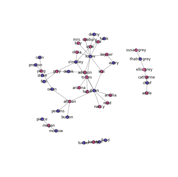
Drawing the hookup graph
Now that we have the data loaded in, we can draw the hookup graph. I color the male characters in blue and the female characters in pink (because gender norms).
colors = {"M": "mediumslateblue",
          "F": "hotpink"}
node_colors = [colors[node[1]["sex"]] for node in G.nodes(data=True)]
pos = nx.spring_layout(G, k=0.075, scale=4)
fig, ax = plt.subplots(figsize=(10, 10))
nx.draw_networkx_nodes(G, pos, node_size=100, node_color=node_colors, ax=ax)
nx.draw_networkx_edges(G, pos, alpha=0.5, ax=ax)
nx.draw_networkx_labels(G, pos, ax=ax)
plt.axis('off')
plt.show()
Building the ERGM
Now comes the important part: building and fitting the ERGM with PyMC.
To start with, we need to know what model we’re actually fitting. I use the simplest one, explaining the network in terms of the number of edges and whether those edges are between nodes with the same gender.
We need two NxN matrices, one for each network statistic. Each cell in each matrix indicates how the presence of that potential edge would change that statistic, holding the rest of the network constant.
For the edge count, the matrix is just all 1s – since any new edge, by definition, increases the edge count by 1. Gender matching is a specific example of attribute matching: we want a matrix $M$ such that $m_{i,j}=1$ if nodes $i$ and $j$ have the same attribute value (e.g. their gender), and otherwise $0$.
Now, here’s one change we make here from the Social Abstractions tutorial. Unlike the prison friendship network, the hookup graph is undirected – if $i$ has hooked up with $j$, then $j$ has obviously also hooked up with $i$. That means we really need only one half of each matrix, either the upper or lower triangle. We can zero out the other triangle, to make sure that we can only realize one edge per dyad.
def edge_count(G):
    size = len(G)
    ones = np.ones((size, size))
    # Zero out the upper triangle:
    if not G.is_directed():
        ones[np.triu_indices_from(ones)] = 0
    return ones
def node_match(G, attrib):
    size = len(G)
    attribs = [node[1][attrib] for node in G.nodes(data=True)]
    match = np.zeros(shape=(size, size))
    for i in range(size):
        for j in range(size):
            if i != j and attribs[i] == attribs[j]:
                match[i,j] = 1
    if not G.is_directed():
        match[np.triu_indices_from(match)] = 0
    return match
# Create the gender-match matrix
gender_match_mat = node_match(G, "sex")
Now we bring in PyMC stochastic variables for the coefficients on both statistics matrices. The prior for them can be pretty arbitrary, but we want them to be able to take on any value, either positive or negative, and be centered on 0. So, normal distributions it is.
The actual term for each statistic is the coefficient times the matrix; since these values are wholly dependent on stochastic variables, they are PyMC deterministic variables themselves.
density_coef = pymc.Normal("density", 0, 0.001)
gender_match_coef = pymc.Normal("gender_match", 0, 0.001)

density_term = density_coef * edge_count(G)
gender_match_term = gender_match_coef * gender_match_mat
term_list = [density_term, gender_match_term]
Next, we create the probability matrix, where $p_{i,j}$ is the probability of an edge between $i$ and $j$. This is another PyMC deterministic variable, since the probability is based on the two terms defined above.
We set the upper triangle to 0 here, so that there is only one probability associated with each dyad.
@pymc.deterministic
def probs(term_list=term_list):
    probs = 1/(1+np.exp(-1*sum(term_list))) # The logistic function
    probs[np.diag_indices_from(probs)] = 0
    # Manually cut off the top triangle:
    probs[np.triu_indices_from(probs)] = 0
    return probs
Finally, we create the outcome variable: it’s a matrix of Bernoulli random values, one for each potential edge, each realized with probability as determined by our mode. This matrix is actually observed as the network’s adjacency matrix. It’s this outcome that PyMC will maximize the probability of the model generating.
# Get the adjacency matrix, and zero out the upper triangle
matrix = nx.to_numpy_matrix(G)
matrix[np.triu_indices_from(matrix)] = 0
outcome = pymc.Bernoulli("outcome", probs, value=matrix, observed=True)
In order to view sample networks drawn from the posterior distribution, I add one more random variable: a simulated outcome. This takes the same form as the outcome matrix above, but isn’t set as observed. Instead, the value of each potential edge will be randomly drawn based on the probs matrix.
sim_outcome = pymc.Bernoulli("sim_outcome", probs)
Fitting the model
With all the variables finally set, we can plug them all into a model object, and start the MCMC process.
model = pymc.Model([outcome, sim_outcome, probs,
                    density_coef, density_term,
                    gender_match_coef, gender_match_term])
mcmc = pymc.MCMC(model)
mcmc.sample(50000, 1000, 50)
[-----------------100%-----------------] 50000 of 50000 complete in 29.3 sec
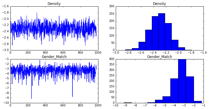
The estimated coefficients and standard errors are computed from the traces:
density_trace = mcmc.trace("density")[:]
gender_match_trace = mcmc.trace("gender_match")[:]

print("Density: {0:.3f}, {1:.3f}".format(np.mean(density_trace), np.std(density_trace)))
print("Gender: {0:.3f}, {1:.3f}".format(np.mean(gender_match_trace), np.std(gender_match_trace)))
Density: -2.307, 0.156
Gender: -3.372, 0.847
These are pretty close to the coefficients and standard errors computed in R, suggesting that the model was specified and fit correctly.
Diagnostics
The R ergm package can plot some diagnostic charts automatically, to help us make sure the model is not degenerate and that chain is mixing well. I plot similar charts below:
fig = plt.figure(figsize=(12,6))
ax1 = fig.add_subplot(221)
ax1.plot(density_trace)
ax1.set_title("Density")
ax2 = fig.add_subplot(222)
ax2.hist(density_trace)
ax2.set_title("Density")

ax3 = fig.add_subplot(223)
ax3.plot(gender_match_trace)
ax3.set_title("Gender_Match")
ax4 = fig.add_subplot(224)
ax4.hist(gender_match_trace)
ax4.set_title("Gender_Match")
plt.show()
Checking the goodness-of-fit
One way to inspect the goodness-of-fit of the model is to take a random realization of the network from the posterior distribution, and see how it compares to the observed network. This is one of the things we can do with the sim_outcome variable we added to the model.
realization = mcmc.trace("sim_outcome")[-1] # Take the last one
Or you can fix the coefficients and draw at random:
# density_coef.value = np.mean(density_trace)
# gender_match_coef.value = np.mean(gender_match_trace)
#realization = sim_outcome.random()
Convert the realized matrix to a full network, and add the node attributes:
sim_g = nx.from_numpy_matrix(realization)

sim_g = nx.relabel_nodes(sim_g, {i: df.index[i] for i in range(44)})
for node in node_attributes:
    name = node["name"]
    for key, val in node.items():
        if key == "name":
            continue
        sim_g.node[name][key] = val
And visualize. We don’t care about the individuals here, since our model was only looking at the gender matching:
colors = {"M": "mediumslateblue",
          "F": "hotpink"}
node_colors = [colors[node[1]["sex"]] for node in sim_g.nodes(data=True)]

pos = nx.spring_layout(sim_g, k=0.075, scale=4)
fig, ax = plt.subplots(figsize=(10, 10))
nx.draw_networkx_nodes(sim_g, pos, node_size=100, node_color=node_colors, ax=ax)
nx.draw_networkx_edges(sim_g, pos, alpha=0.5, ax=ax)
#nx.draw_networkx_labels(sim_g, pos, ax=ax)

_ = ax.axis('off')
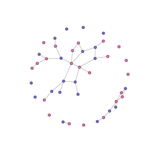
This graph looks ‘about right’ (a really scientific assessment), and the model seems to be capturing a lot of the tendency towards heterosexual pairings (though there appear to be more same-sex pairs, and especially pairs of women, than observed in the actual data). There are also more singletons than observed in the actual data – though about as many as produced by the R model.
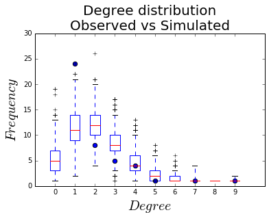
Degree distribution
Another way of assessing the goodness-of-fit is comparing the degree distribution of the simulated networks to the observed one. The R ergm package has that built in, but here we have to do it ourselves.
To do it, we count the number of nodes of each degree in the observed network, and across all of the simulated networks, and plot them together.
from collections import defaultdict, Counter
Observed degree distribution:
obs_deg_freq = Counter(nx.degree(G).values())
x = list(obs_deg_freq.keys())
y = list(obs_deg_freq.values())
Simulated degree distributions:
deg_freq = defaultdict(list)
# We don't care about node properties here, just the degree.
for realization in mcmc.trace("sim_outcome")[:]:
    sim_g = nx.from_numpy_matrix(realization)
    for deg, count in Counter(nx.degree(sim_g).values()).items():
        deg_freq[deg].append(count)

vals = list(deg_freq.values())
labels = list(deg_freq.keys())
And finally, plot: black dots for the observed degree count, box-and-whiskers plots for the distributions.
fig, ax = plt.subplots()

h = ax.boxplot(vals, positions=labels)
ax.scatter(x, y, s=40)
ax.set_xlim(-1, 10.5)
ax.set_ylim(0, 30)
ax.set_xticklabels(labels)
ax.set_xlabel("$Degree$", fontsize = 20)
ax.set_ylabel("$Frequency$", fontsize = 20)
ax.set_title("Degree distribution\nObserved vs Simulated", fontsize = 20)

plt.show()


Leave a Comment